During the early hours of Thursday, 30th June, it's time for the last update of Visiba Care before the summer holidays! With this release, it will be possible to:
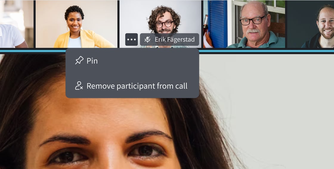
- select who is shown on the big screen in multiparty calls
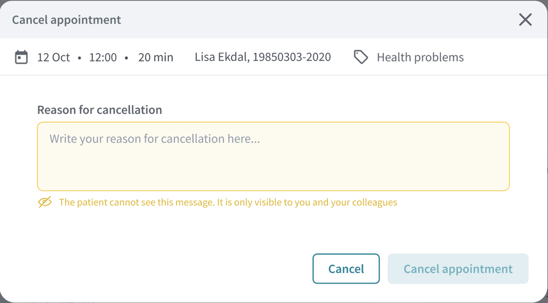
- write a note about why a video conference has been canceled
In July, we won't release anything new, but look forward to launching some really nice news in August that will improve the user experience for both patients and healthcare professionals. Until then, we want to wish you a nice summer!
Further down, you can also see what's going on in the subsequent update, which we plan to release in mid-August.
Pin participant in the video call
Soon healthcare professionals can choose who will be shown in the big picture in the multi-party conversation! This can be extra useful when a visual interpreter is attending, or in consultations with children and their parents. By choosing to pin a participant, this person is shown in the big picture in the conversation, regardless of who is talking. The function is also available to the patients and guest participants who participate via the web interface in the computer.

Add information about reason for cancellation

Coming up in Visiba Care
In the subsequent update, which will be released in mid-August, we look forward to launching a number of features that will improve the user experience for both patients and healthcare professionals:
New lobby - with technical test
Make sure the technology works before the meeting! With the new lobby, it will be easier for healthcare professionals as well as patients and guests to test the microphone and camera before the conversation begins.
Blur the background of the video call
Soon it will finally be possible to blur the background of the video call! With this, you not only avoid cleaning the room before the conversation - a calm and neutral background also provides the conditions for better conversation focus.
Improved chat design
After the summer, patients will be able to enjoy major improvements in both design and user-friendliness when chatting with healthcare professionals. The improvements will take place both in the patients' web interface and in the apps.
More structured view for My cases
We will redo the patient's My cases view to present information about ongoing and closed cases in a more clear and structured way.
The first step towards a more mobile-friendly web
Our work to improve the patient web continues, and soon patients will also be able to access parts of the web on their smartphones. In the first step, they will be able to reach the My Cases view and have messaging conversations.
You can read more detailed information in our release notes which are published with each update. You can also get an overview of the different user permissions each change applies to and the upcoming changes in the patient apps.